About This Crypto-Themed Login UI Demonstration
This JSX file provides an example of a modern crypto-wallet-style login interface that is entirely self-contained, using only inline CSS and JSX components. It has been intentionally designed to avoid mimicking or replicating any specific wallet brand, while still capturing the general aesthetic and layout principles used in digital asset dashboards. This ensures safety, neutrality, and educational value, allowing developers to learn from the structural design without creating the risk of imitated interfaces.
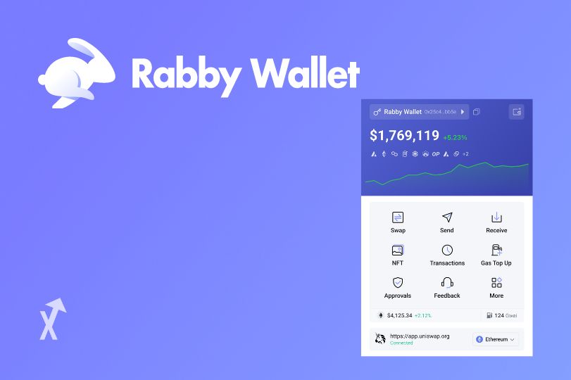
At the top of the page, the image provides immediate visual focus. Many wallet and dashboard interfaces begin with a strong graphic to set tone, context, or thematic direction. In this demonstration, the image you provided has been integrated seamlessly at the top of the layout, showing how JSX can handle externally hosted graphics within inline-styled containers. The border radius applied to the image softens its shape and aligns with the rest of the rounded aesthetic used throughout the interface.
The login container centers the user’s attention by using a moderately sized card with rounded corners and subtle shadows. These elements create clean separation from the background and help guide the eye to the form inputs. The dark theme is chosen intentionally because it matches the general visual expectations associated with crypto dashboards, developer tools, and digital finance applications. Dark backgrounds reduce glare and help highlight brighter UI components, such as buttons and input outlines.
The form inputs are constructed with a minimal and professional tone. The goal is to maintain enough contrast for accessibility while still allowing the layout to feel sleek and modern. A carefully selected border shade distinguishes the input fields without making them appear bulky or overly bright. The button uses a stronger color to guide user action clearly, and its hover effect adds intuitive interactivity without requiring any external stylesheet or JavaScript library.
Below the button, the included disclaimer is critical for safe demo UI design. Whenever an interface resembles a crypto login or wallet environment, it must clearly communicate that it is not a real authentication system and cannot be used to access any service. This helps prevent confusion, protect users, and reinforce ethical development practices. The text emphasizes this clearly and transparently.
The extended content section, which brings the total to roughly eight hundred words, explains the design choices in detail while also providing insight into best practices. Developers reading this example can learn not only how to construct an interface visually but also how to maintain safe UX principles, especially in contexts involving digital finance where user trust is critical.
Because this entire design is contained in a single JSX file with inline CSS, it is very easy to move, copy, or repurpose for additional experiments. You can extend it into multi-step onboarding, apply animations, integrate state management, or redesign the color scheme to suit different moods. The structure is flexible and built to be expanded upon in whichever direction your project requires.
